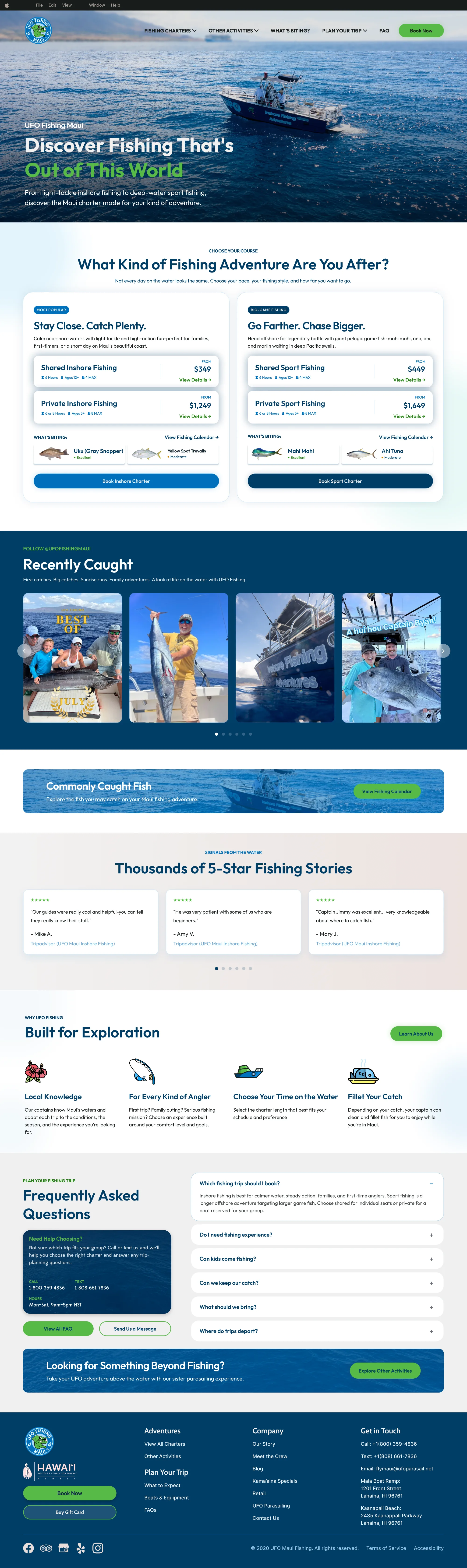


Design around the customer’s first decision
Fishing starts with trip selection. Parasailing starts with location. Each website’s structure reflects that difference.

The websites needed to feel like part of the same brand without becoming copies of one another.
Fishing visitors needed help choosing a charter. Parasailing visitors needed to select an island, compare flights, and feel confident about safety before booking.
I created a shared foundation for color, typography, photography, components, and booking behavior, then adapted each site around its primary customer decision.
Two connected experiences with a clear purpose:
Both websites use:
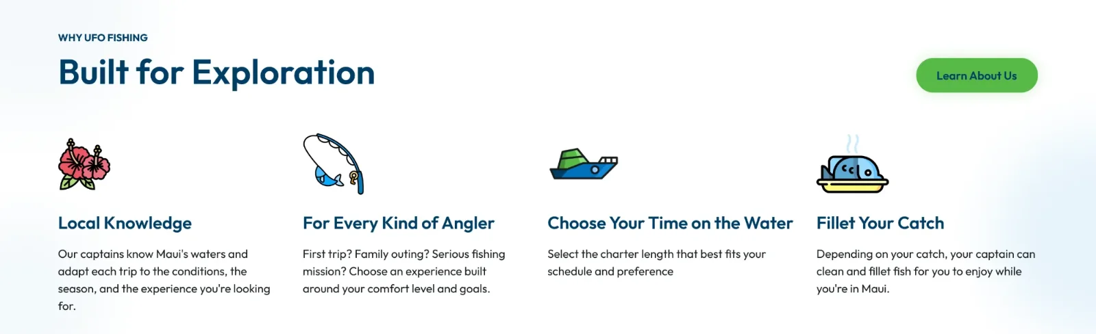
UFO Fishing feels deeper and more exploratory, using imagery of catches, crew members, families, and life on the water.
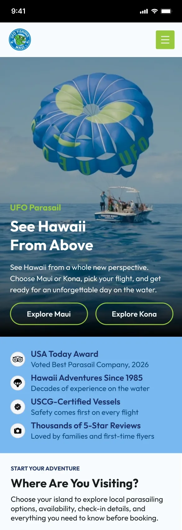
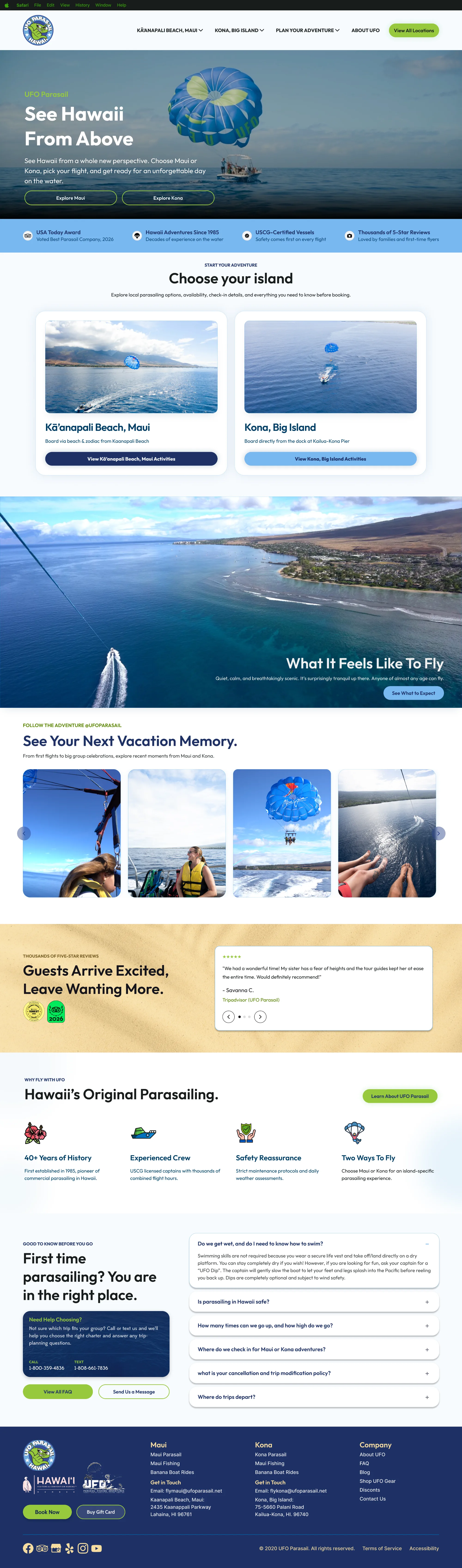
UFO Parasail feels lighter and more open, using sky, coastline, horizon, and in-flight imagery to communicate the feeling of seeing Hawaii from above.
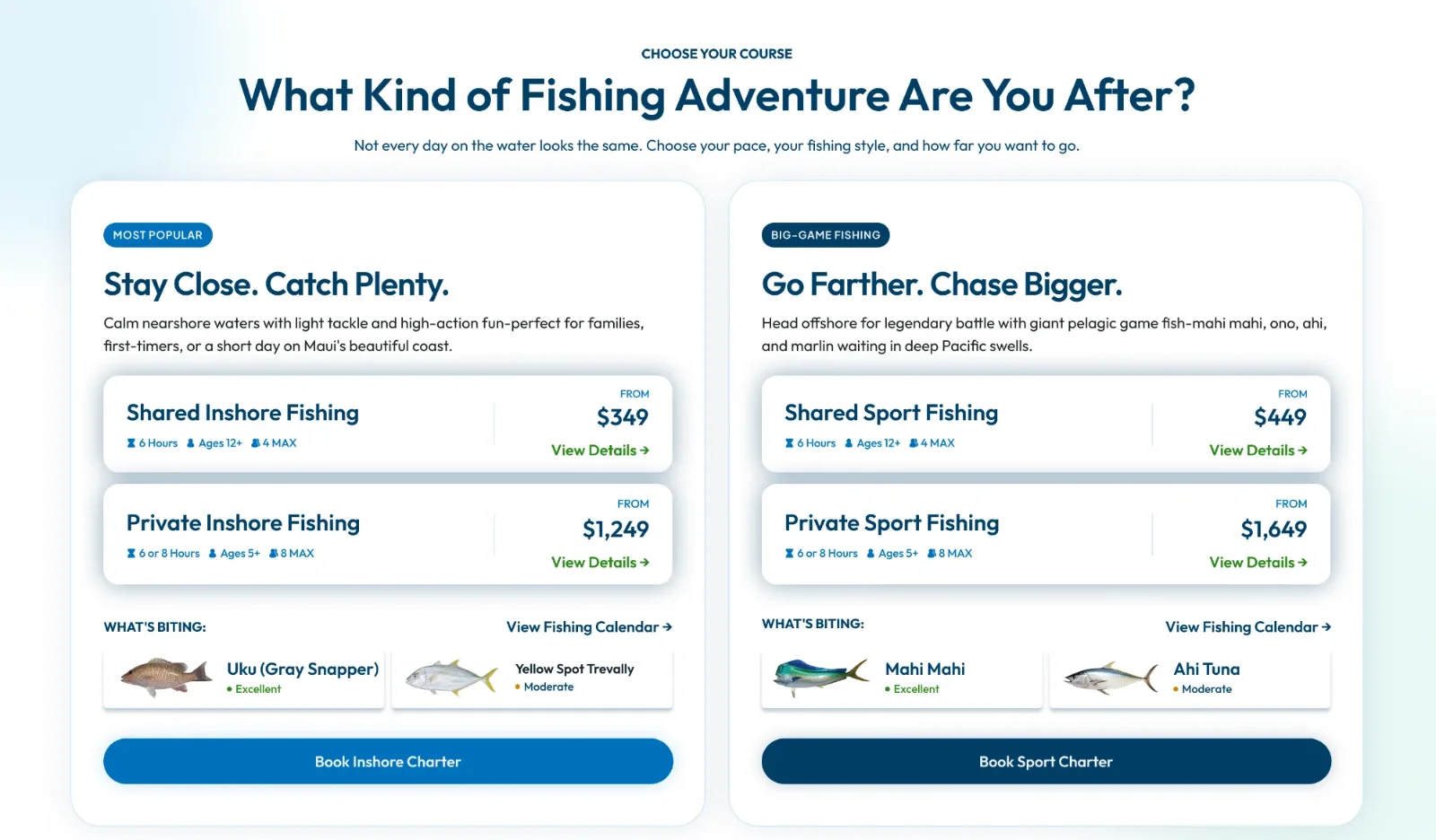
The fishing homepage was designed around one customer question:
Which trip is right for me?
Guided pathways, charter comparisons, and a seasonal What’s Biting feature helped visitors choose based on experience level, group type, trip length, and fishing goals.
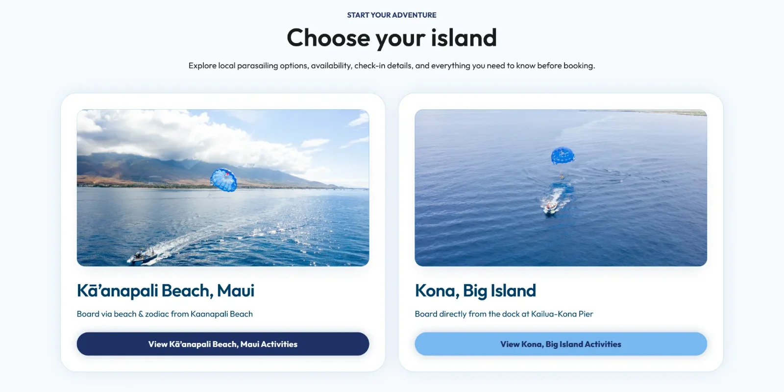
The parasailing homepage began with a simpler decision:
Maui or Kona?
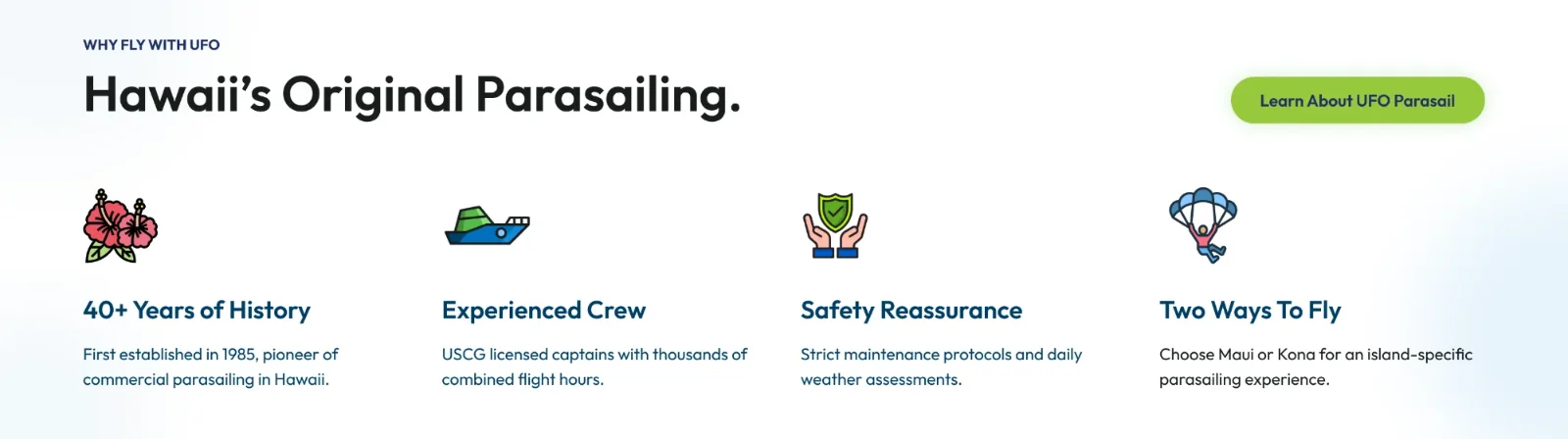
After choosing an island, visitors could compare the 800-foot and 1,200-foot flights, review participation requirements, understand the boarding process, and check availability.
Safety information, reviews, and answers for first-time flyers appeared near the booking decision rather than being buried farther down the page.
Fishing starts with trip selection. Parasailing starts with location. Each website’s structure reflects that difference.
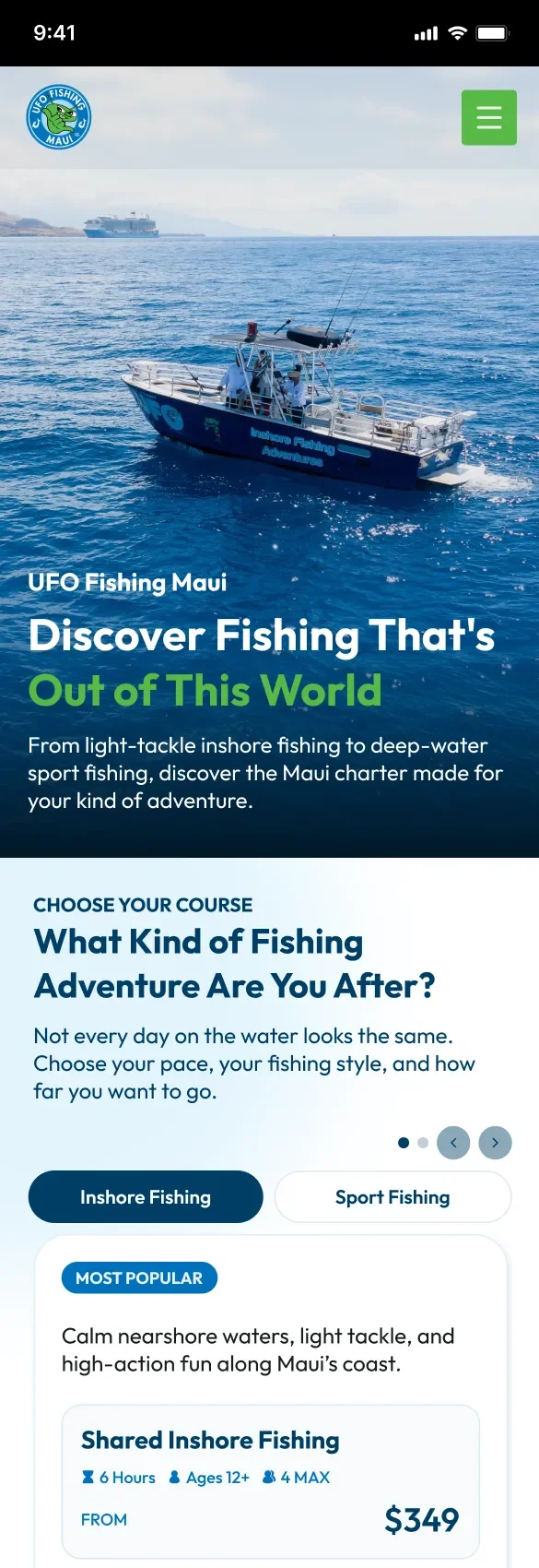
Mobile visitors began dropping off around 20–30% scroll depth, so comparison details, trust signals, and booking actions were placed near the top.
The websites share recognizable visual and interaction patterns while maintaining separate domains, content, and search targets.
The goal was not to make two identical websites. It was to create a shared design language that could flex around two different customer journeys.
The result gives UFO a more consistent digital brand while making each adventure easier to understand and book.