
↑
Nori Page
Web Design · Responsive

Fury Water Adventures

Unifying three destinations into one faster booking experience

Role
Sr. Web Designer
Timeline
4 weeks · Discovery through developer handoff
Team
Led by Nori Page, with support from two designers
Scope
Discovery, information architecture, responsive web design, multi-location system, booking strategy, and developer documentation
Fury desktop homepage
Fury mobile homepage

Overview

The challenge

Fury’s experiences were divided across separate websites, dashboards, and locations. The existing Key West website was difficult to navigate, important information was buried, and bringing everything together introduced a new challenge: supporting three destinations without creating confusion or compromising Key West’s established business and search visibility.

The approach

I created a shared experience that kept Key West as the primary entry point while making Marathon and St. Augustine polished, visible, and easy to explore.

The strategy simplified navigation, standardized activity presentation, clarified departure locations, and prioritized speed throughout the booking journey.

The outcome

A unified, location-aware website direction designed to scale across destinations, activities, seasonal offerings, and future expansion.

What shaped the design

Discovery established four priorities:

  • Key West represented approximately 90% of the business and needed to remain the primary focus.
  • Visitors needed fewer decisions and fewer clicks before booking.
  • Location and departure information had to remain visible throughout the journey.
  • Performance was essential, particularly on mobile.

These requirements made information architecture and system design as important as the visual redesign.

Key design decisions

01

Lead with Key West without hiding other destinations

The homepage maintained a Key West-first hierarchy while creating clear entry points into Marathon and St. Augustine.

Location landing pages gave each destination its own activities, departure details, and supporting content without making the three locations feel like unrelated websites.
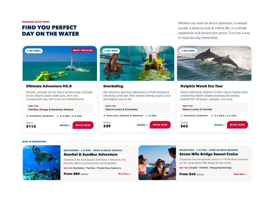
Fury desktop homepage, full page
Fury mobile homepage, full page
Responsive homepage. Scroll inside each frame.
02

Make location part of every decision

Similar experiences could operate differently depending on their destination, vessel, or departure point. Location labels were therefore integrated into navigation, activity cards, headers, and booking paths.

Visitors could understand where an experience operated before reaching the final booking step.

Location landing page
Location labels
03

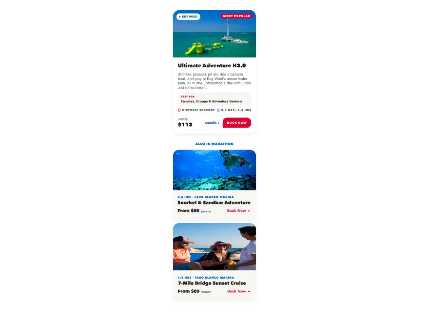
Standardize activity discovery

A shared activity-card system made a large catalog easier to scan across locations.

Each card prioritized:

  • Departure location
  • Duration
  • Dynamic per-person pricing
  • Relevant seasonal or experience badges
  • A clear booking action

Secondary information was intentionally removed from cards to reduce decision fatigue.

Desktop activity cards
Desktop
Mobile activity cards
Mobile
1 / 2
04

Simplify the path to booking

Persistent Book Now actions, scannable activity details, and prominent FareHarbor calendars kept booking accessible throughout the experience.

The navigation supported browsing by both location and activity type, allowing visitors to begin with whichever decision was easier for them.

Desktop Video Add an MP4 to assets/ and set its path in Tweaks → desktopVideo
Open interactive desktop prototype ↗
Mobile Video Set its path in Tweaks → mobileVideo
Open mobile prototype ↗
Prototype walkthrough, desktop and mobile.
05

Treat speed as a design requirement

The original direction included interactive maps, but their performance cost conflicted with the goal of a fast, mobile-forward website.

The experience instead used static imagery or lightweight map embeds, limited video, compressed photography, and restrained motion. This kept important departure information visible without slowing the path to booking.

Visual direction

The website needed to feel like a real Florida adventure rather than a polished luxury resort.

Blue provided the primary foundation, white supported clarity, and red was reserved for high-attention moments such as booking actions.

Rich guest photography, families, crew interactions, boats in motion, sunsets, and water created an energetic visual foundation. Rounded cards, varied image shapes, asymmetrical actions, and layered compositions prevented the interface from feeling rigid or overly corporate.

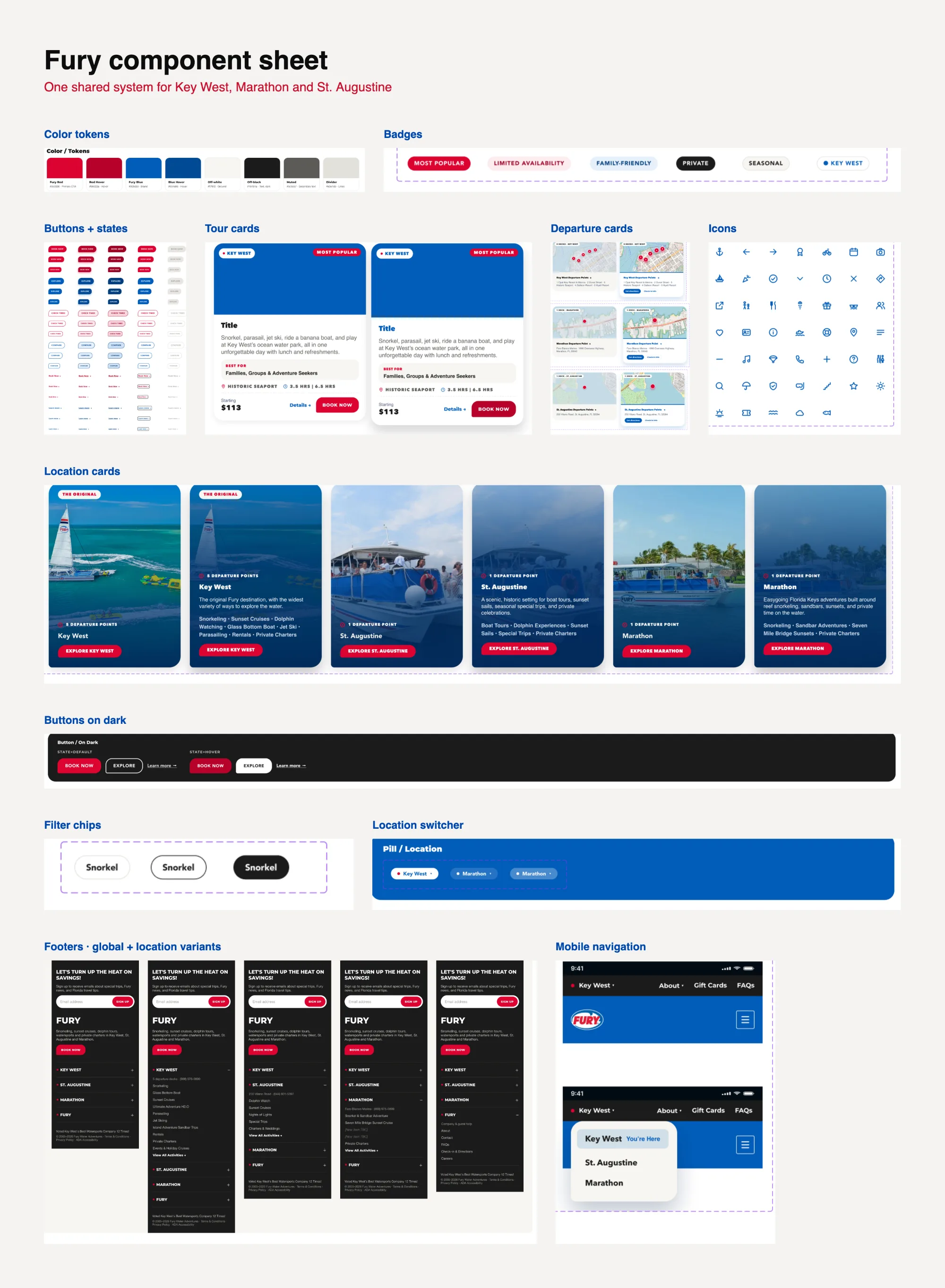
Fury component sheet: color tokens, badges, buttons, tour, departure and location cards, icons, filter chips, location switcher, footers and mobile navigation
Component sheet shared across all three locations.

Multi-location design system

The website direction established reusable patterns for:

The shared system created consistency while still allowing each destination to present its own activities, imagery, departure points, and local content.

  • Global and location-specific navigation
  • Activity and category cards
  • Location labels
  • Seasonal and availability badges
  • Persistent booking actions
  • Location landing pages
  • Activity-detail pages
  • FareHarbor calendar placement
  • Reviews and trust content
  • Departure maps and check-in information
  • One global footer and three location-specific footers
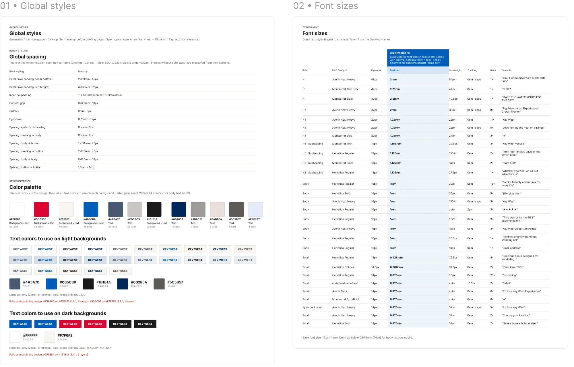
Fury global styles: spacing, color palette and font sizes
Global styles: spacing, color palette and type sizes.

Responsive behavior

The experience was designed around vertical mobile browsing, clear activity comparison, and highly visible booking actions.

Layouts became simpler as screen space decreased. Location context remained visible, activity information stayed scannable, and imagery supported the experience without obstructing essential content or slowing the page.

Developer handoff

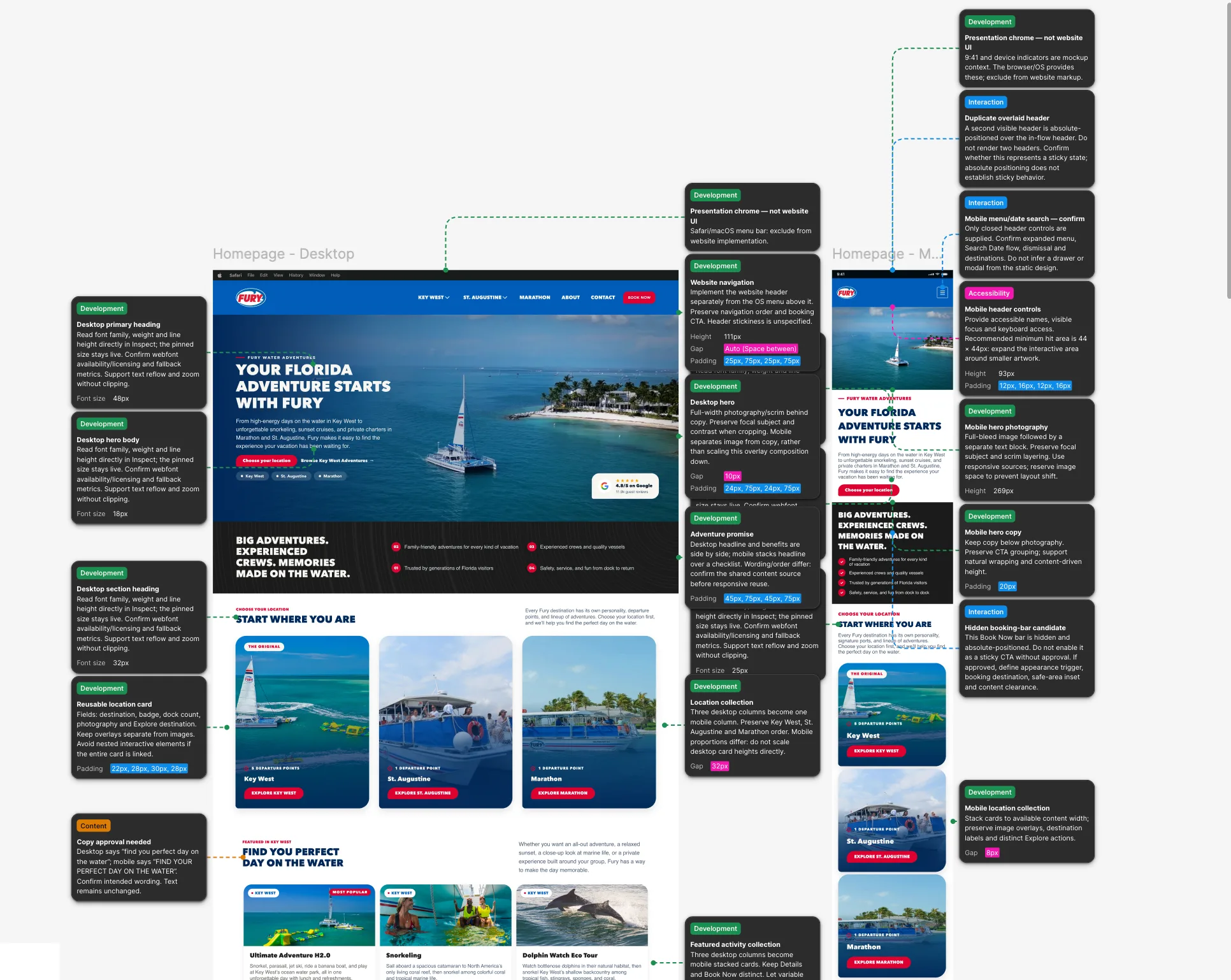
The handoff documented the responsive layouts, reusable components, location variants, content hierarchy, booking behavior, and performance considerations needed to build the unified experience consistently.

It also identified the areas that required flexible content management, including seasonal activities, featured events, location-specific footers, and future destination expansion.

Annotated Fury homepage handoff for desktop and mobile, with development, interaction, accessibility and content notes
Annotated homepage handoff: development, interaction, accessibility and content notes for desktop and mobile.

Reflection

The central design challenge was not simply combining three websites. It was deciding what should remain shared, what needed to change by location, and how to preserve the strength of the primary Key West business within a scalable system.

Treating location as a persistent part of the interface made the experience easier to navigate today while creating a clearer foundation for Fury’s future growth.

Next project Sea Maui Web Design · Booking View case study →
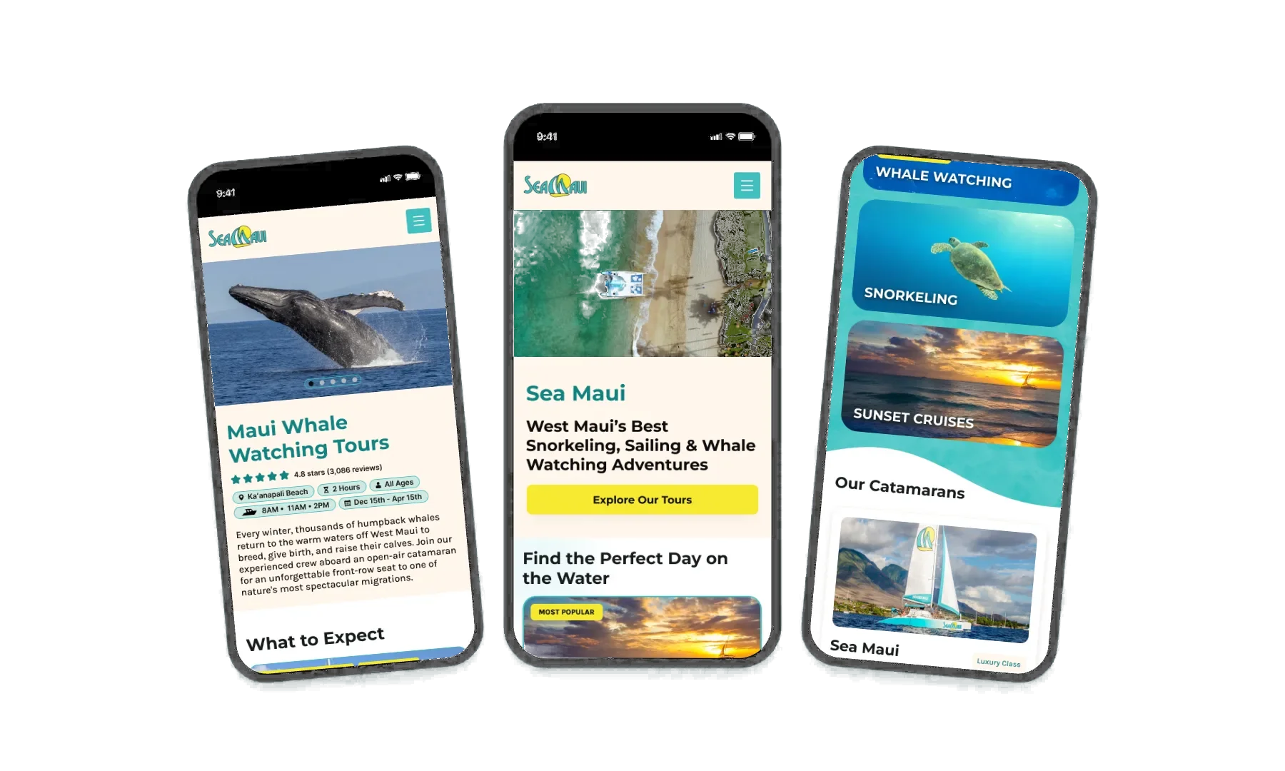
Sea Maui device mockup