Mexico Whale Shark
A modern, immersive refresh of an existing booking website
- Role
- Sr. Web Designer
- Timeline
- 1 week · Discovery through developer handoff
- Scope
- Redesign
Overview
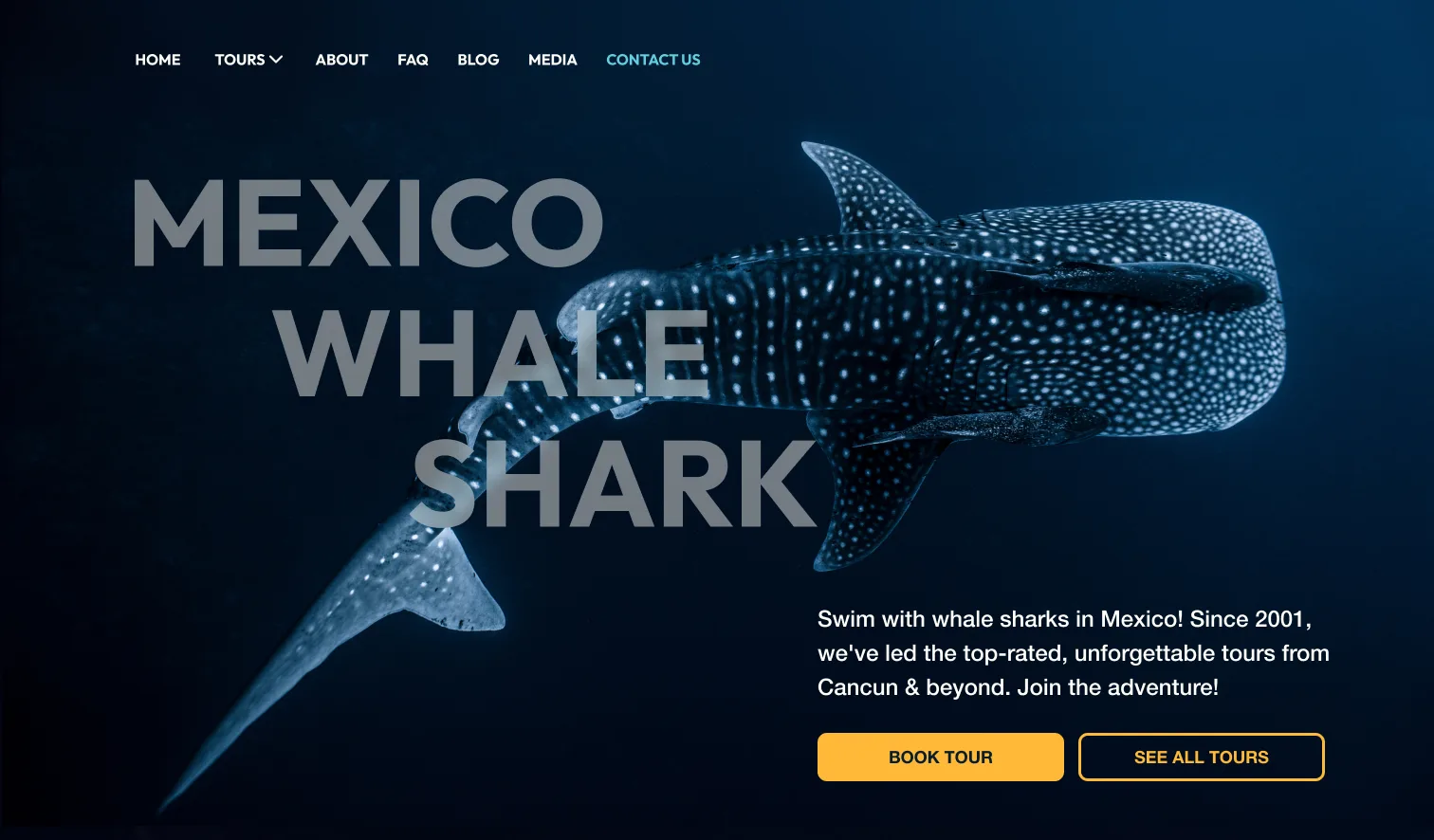
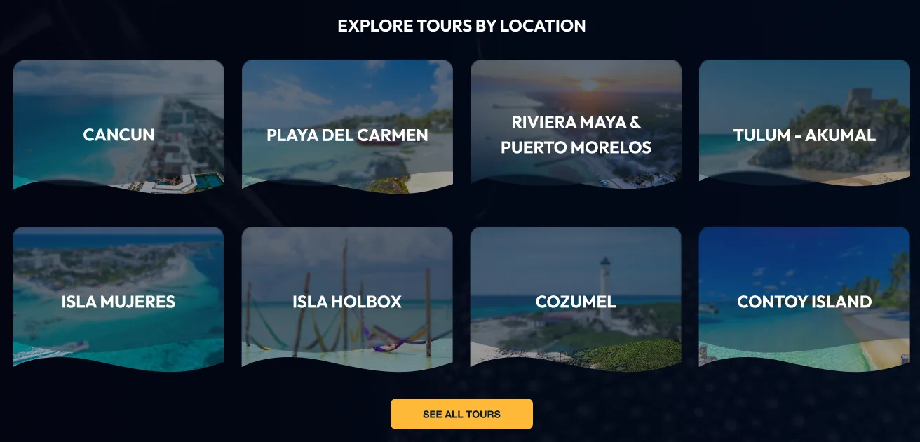
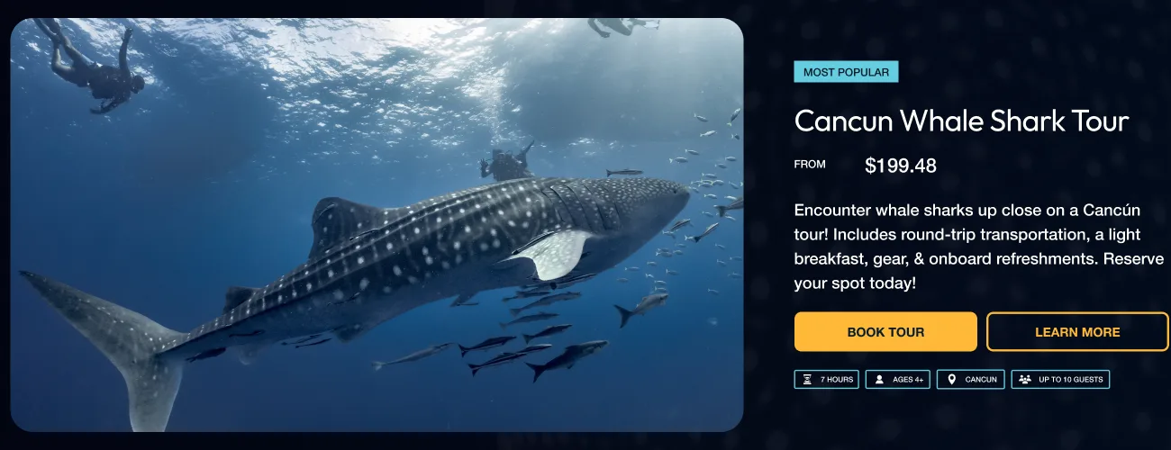
The primary goal was to simplify how visitors explore and book a whale shark tour. The existing activity setup made the available options feel more complicated than necessary, so the new design focused on clearer tour organization, stronger hierarchy, and a more direct path to booking.
- Introduce a completely new visual direction
- Simplify how tours are presented
- Make the booking journey easier to follow
- Keep primary calls to action prominent
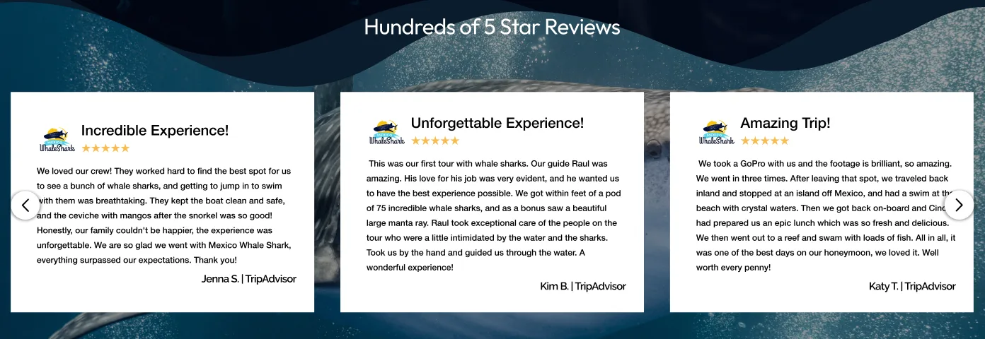
- Use TripAdvisor and Google reviews to build trust
- Preserve useful content within a clearer structure
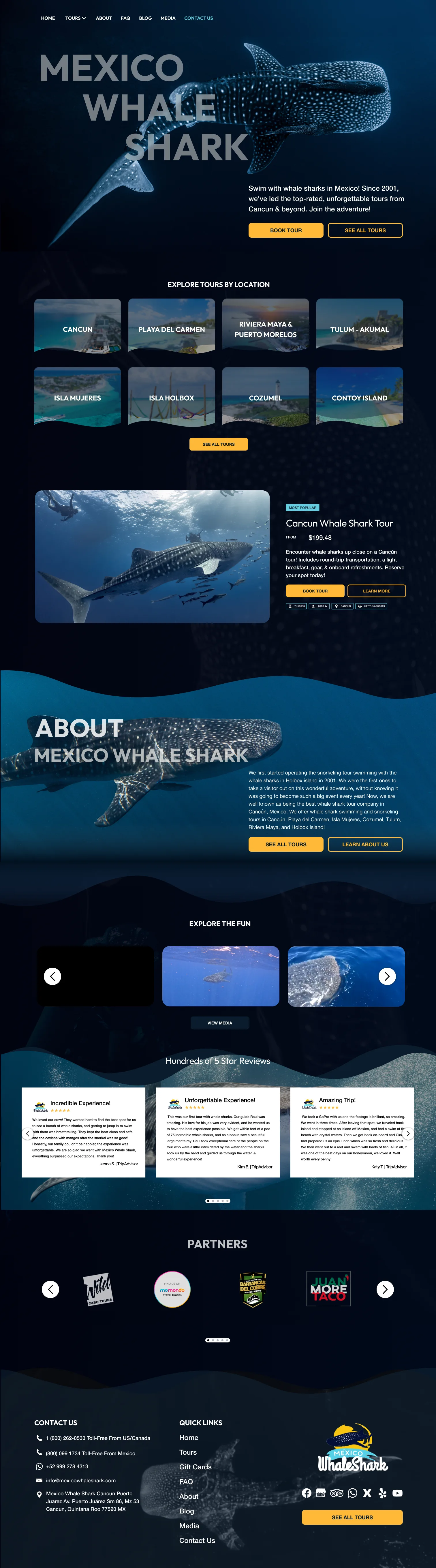
The homepage uses immersive marine photography to establish the experience, followed by simplified tour options and clear booking actions.
Prominent review content helps reassure travelers before they commit, while the streamlined page structure reduces unnecessary decisions between discovering a tour and checking availability.
UI Design
The full desktop homepage, from hero to footer. Scroll inside the frame.
Responsive experience
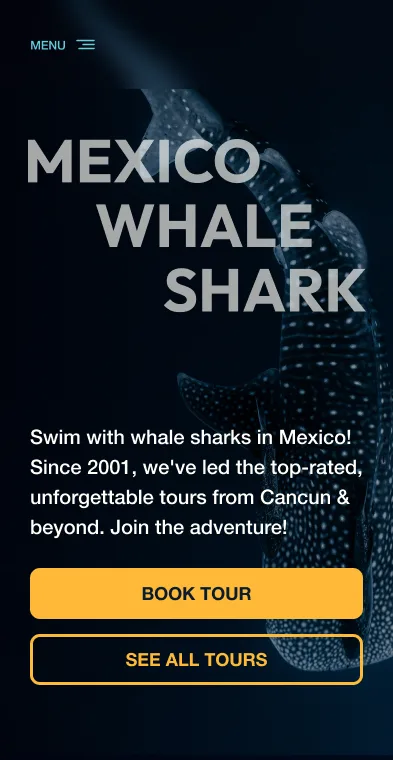
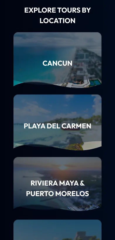
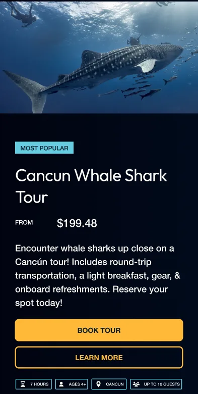
Each section is reworked for mobile rather than scaled down.
Design system
A small set of colors, two typefaces and a few booking components carry the whole site.
Intended outcome
A more engaging and trustworthy website that helps visitors understand their options, feel confident booking the experience, and move from discovery to availability with less friction.