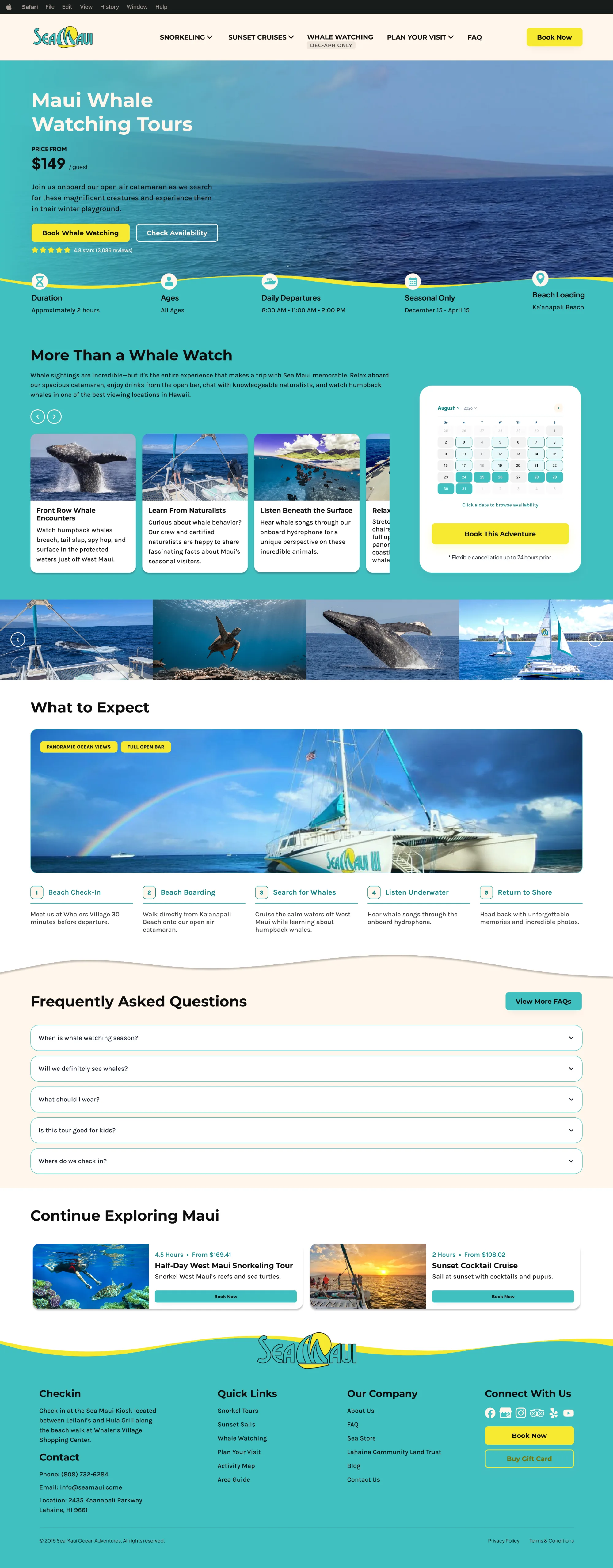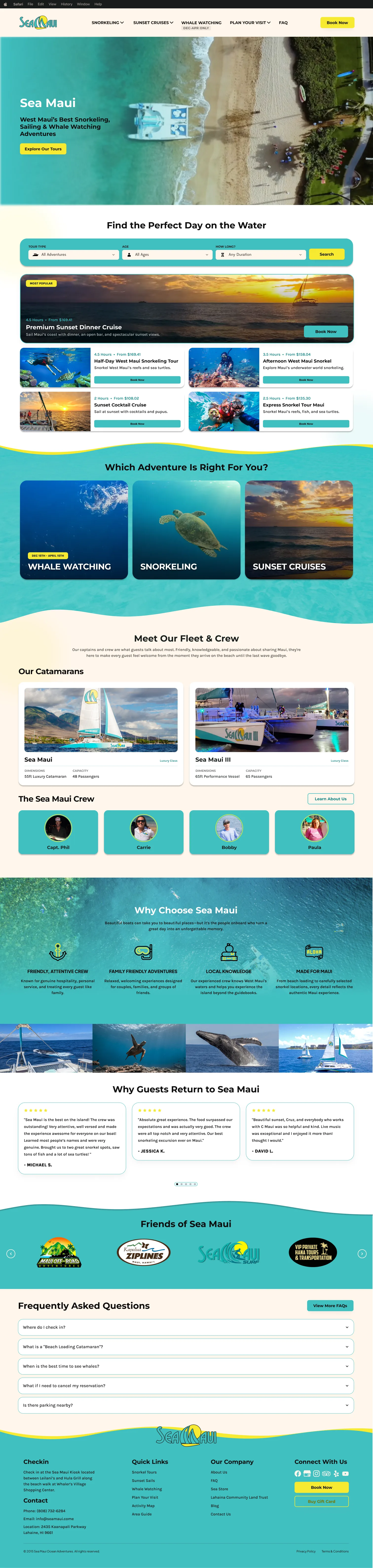

Show people, not just boats
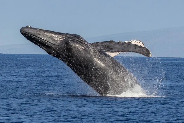
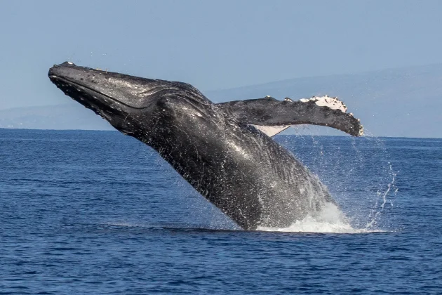
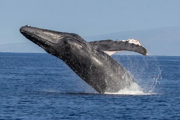
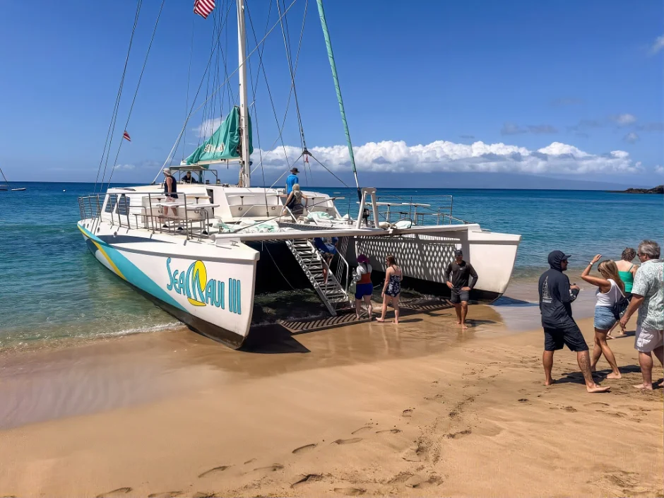
I built the visual story around real guest moments, crew interactions, families, couples, and life on the water. Boats and Maui scenery support the story rather than becoming the entire story.

Modernize a website that already converted, and show what makes Sea Maui different.
Keep the proven booking path. Put guests and crew at the center of the story.
A responsive, people-first site with reusable components and a seasonal content system.
I led discovery with Sea Maui’s stakeholders, which revealed four priorities:
I used these findings to prioritize clarity and confidence over unnecessary restructuring.
I built the visual story around real guest moments, crew interactions, families, couples, and life on the water. Boats and Maui scenery support the story rather than becoming the entire story.
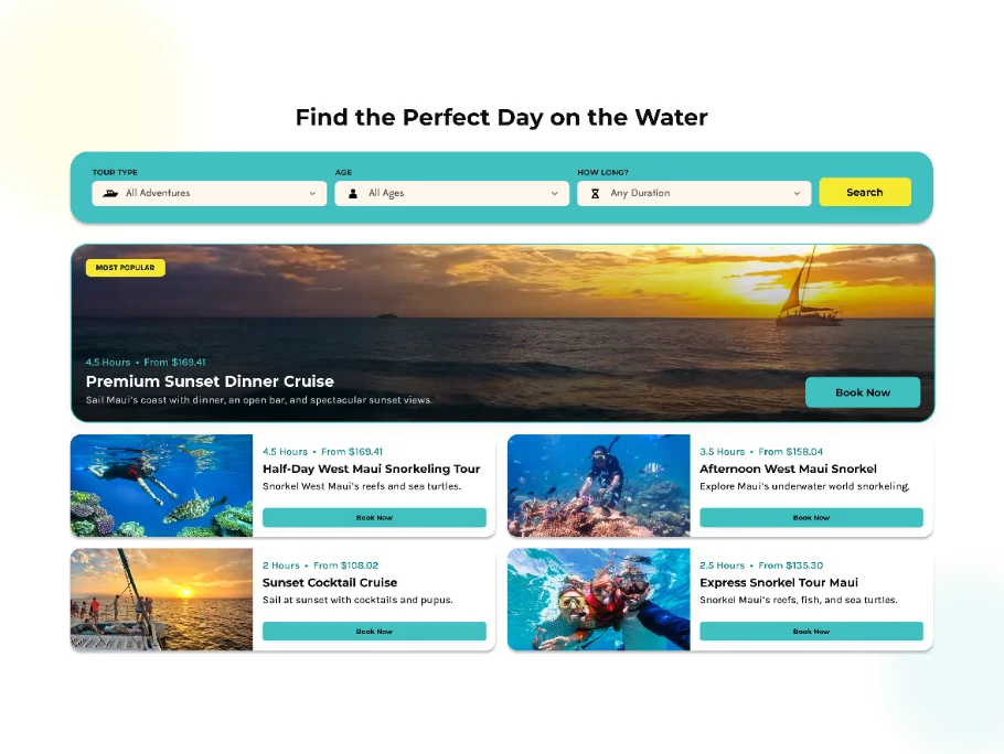
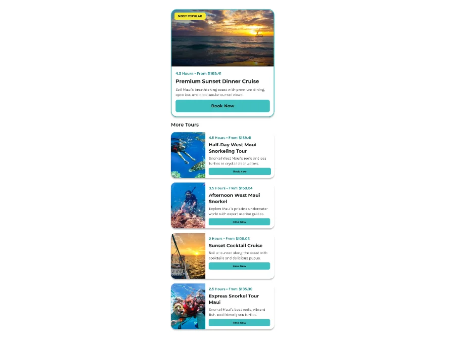
I designed featured activities as a more visual browsing experience on desktop and a simpler stacked presentation on mobile, making tours easy to compare across screen sizes.
I treated whale watching as a reusable seasonal state with promotional, seasonal, and out-of-season treatments instead of a page that had to be repeatedly added and removed.
I combined large experiential photography with organic shapes, wavy transitions, rounded components, playful color blocking, and generous spacing.
The result feels recognizably Sea Maui: polished but not pretentious, energetic but not overwhelming, and premium without becoming a luxury-resort experience.
Montserrat’s wide, geometric letterforms give headlines a confident, friendly voice that holds up over full-bleed ocean photography. Karla pairs with it as a relaxed, slightly quirky grotesque that stays legible at small sizes on mobile, so planning details like times, inclusions and FAQs read easily without feeling corporate.
I used photography, video, FAQs, and destination content to answer questions before booking.
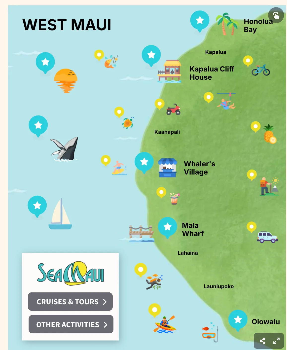
I designed a Where Do We Go experience around the destinations Sea Maui visits, and used visual storytelling to make beach loading easier to understand than text alone.
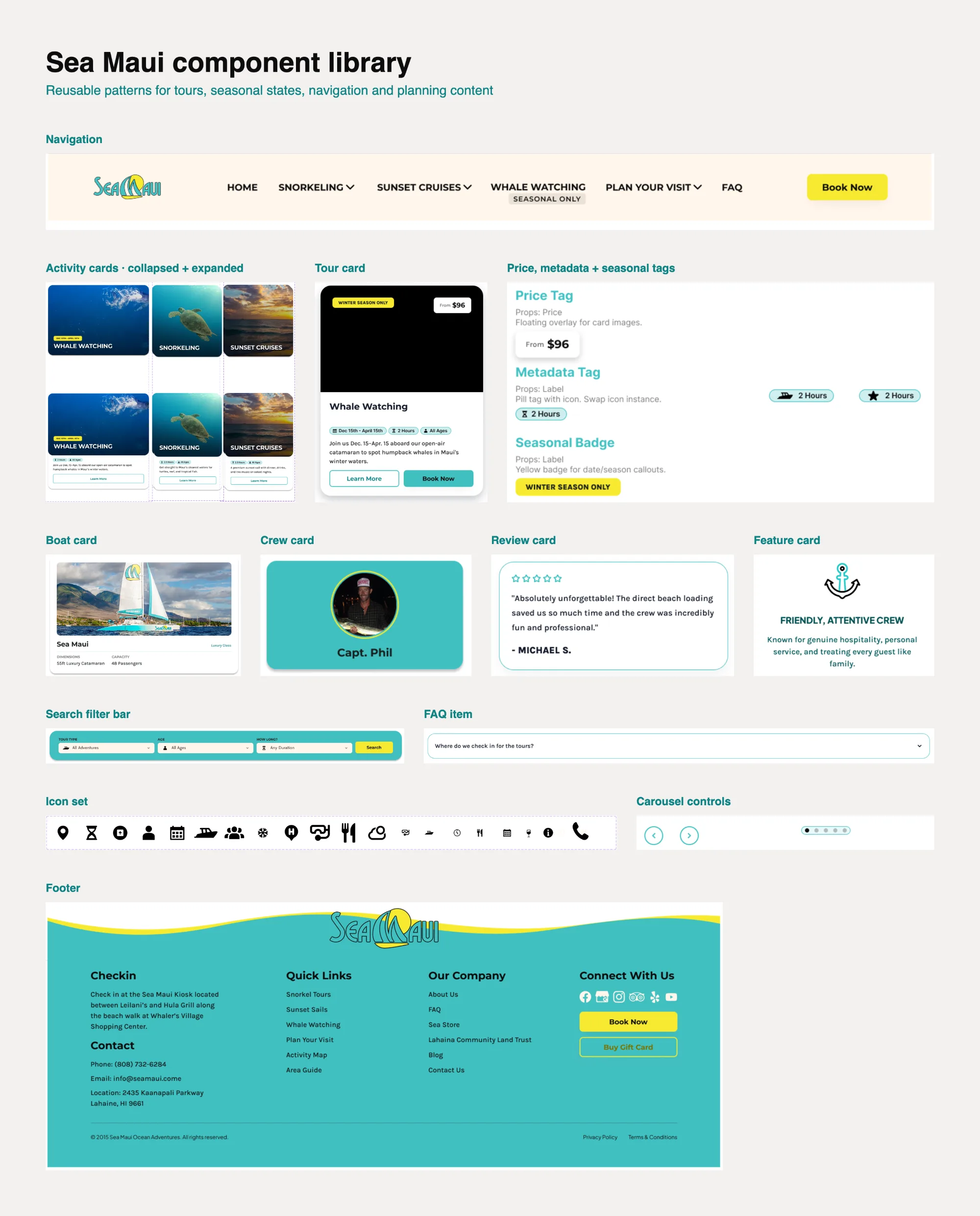
I created reusable patterns for:
The system gave the website a consistent visual identity while keeping content flexible and maintainable.
| Style | Desktop | Tablet | Mobile |
|---|---|---|---|
| H1 | 2.5–3rem | 2.2rem | 1.8–2rem |
| H2 | 2rem | 1.8rem | 1.6rem |
| H3 | 1.75rem | 1.6rem | 1.4rem |
| H4 | 1.5rem | 1.4rem | 1.25rem |
| H5 | 1.25rem | 1.2rem | 1.1rem |
| H6 | 1.125rem | 1.1rem | 1.05rem |
| Body | 1rem | 1rem | 0.95–1rem |
| Small | 0.875rem | 0.875rem | 0.85–0.9rem |
Over three weeks, I led the project from stakeholder discovery to responsive design and developer-ready documentation.
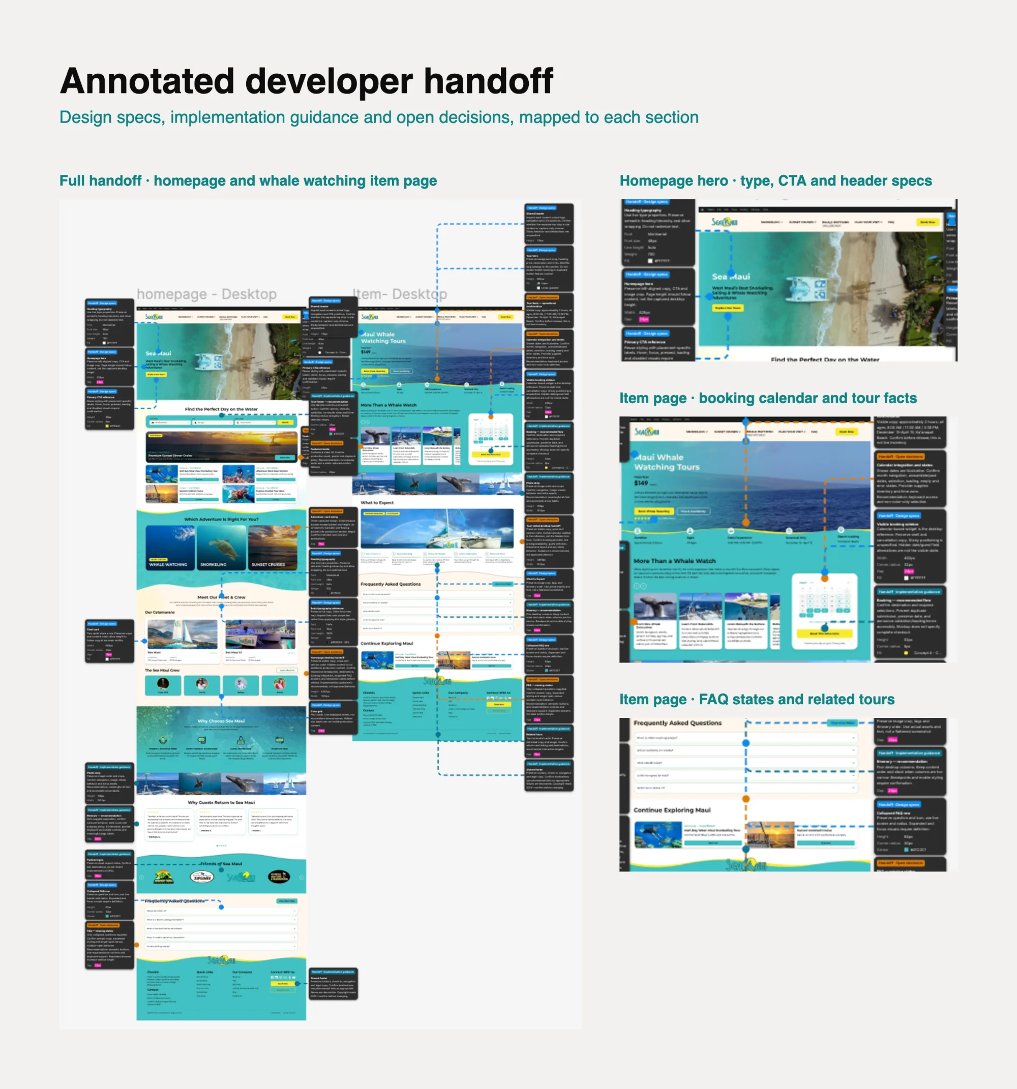
My handoff defined component behavior, responsive layouts, visual styles, content priorities, and seasonal states so the experience could be implemented consistently.
The strongest solution I found was not a complete reinvention. It was a focused evolution that protected proven booking behavior while making Sea Maui’s most valuable differentiator—its people—visible throughout the experience.